COMPANY
La Botiga del Molí
MY DELIVERABLES
Visual identity design, visual identity manual, final artwork for brand applications.
TOOLS
Adobe Illustrator.
YEAR
2021
La Botiga del Molí
Project Introduction
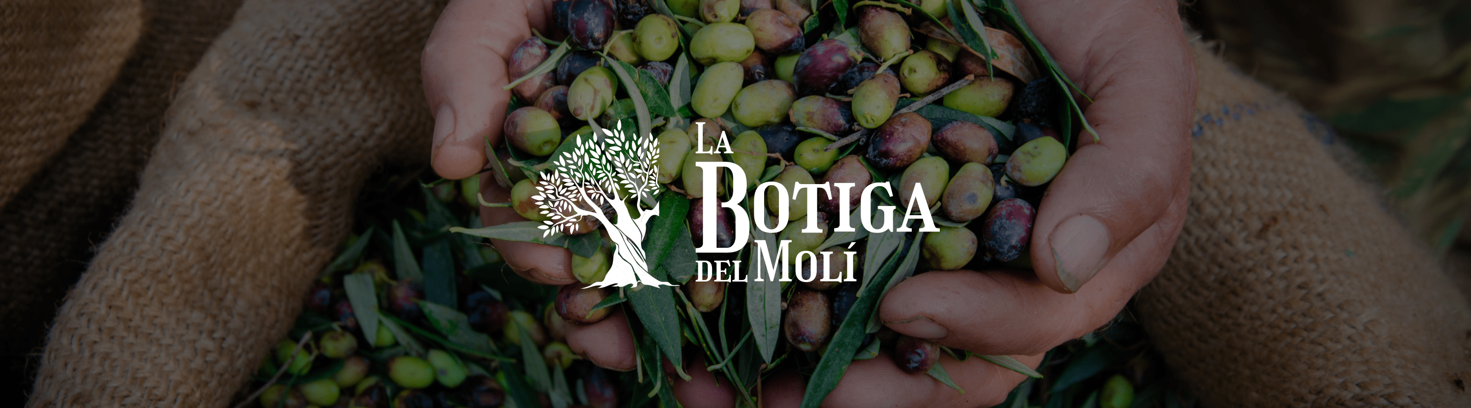
La Botiga del Molí is the commercial brand of an olive oil cooperative under the DOP Siurana designation, which is part of Grupo Unió, a cooperative organization founded in 1942 committed to the economic, social, and environmental sustainability of the agricultural sector. This project focused on designing a visual identity that encapsulated the essence of the brand: deep ties to the land, tradition, and the quality of a product crafted with care and proximity.
Creative Concept and Process
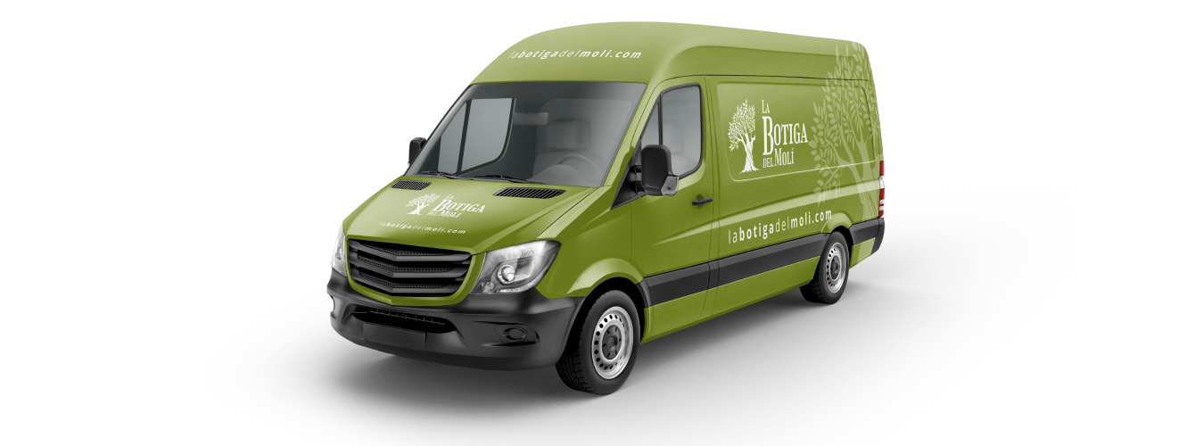
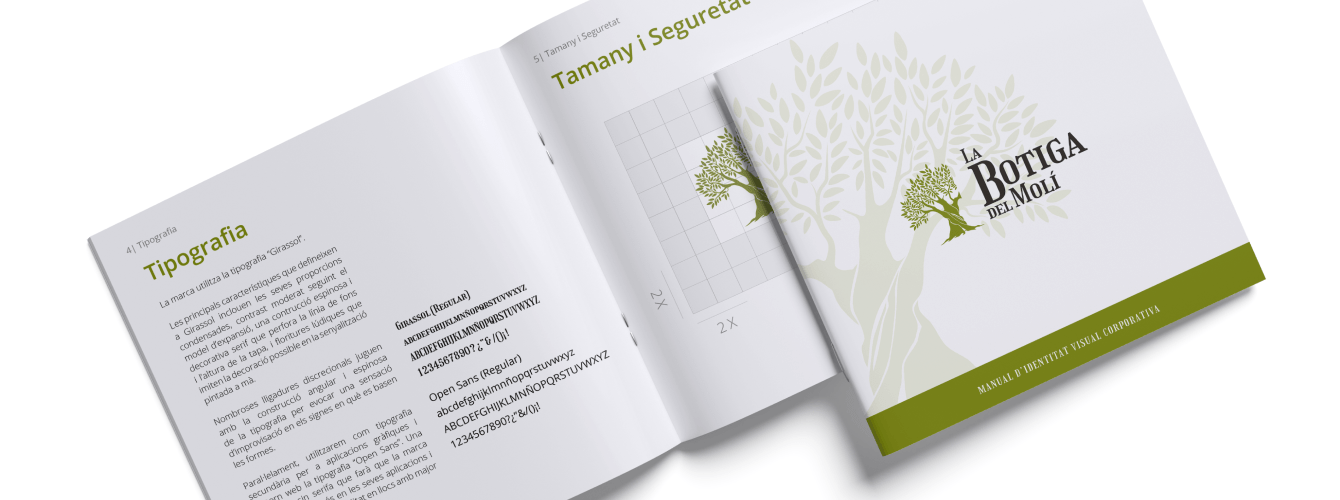
The development of the visual identity centered on directly and symbolically representing the connection between the brand and its agricultural roots. A logo was designed featuring the silhouette of a robust olive tree, emphasizing its sturdy base as a metaphor for rootedness and tradition. The chosen typography evoked the graphic style of old apothecaries, with pronounced serifs and elongated proportions, giving it a classic and artisanal feel. Given the length of the name, "La Botiga del Molí," different typographic sizes were used to highlight "Botiga" and "Molí" as the main elements, achieving a balanced and readable design.
Results and Impact
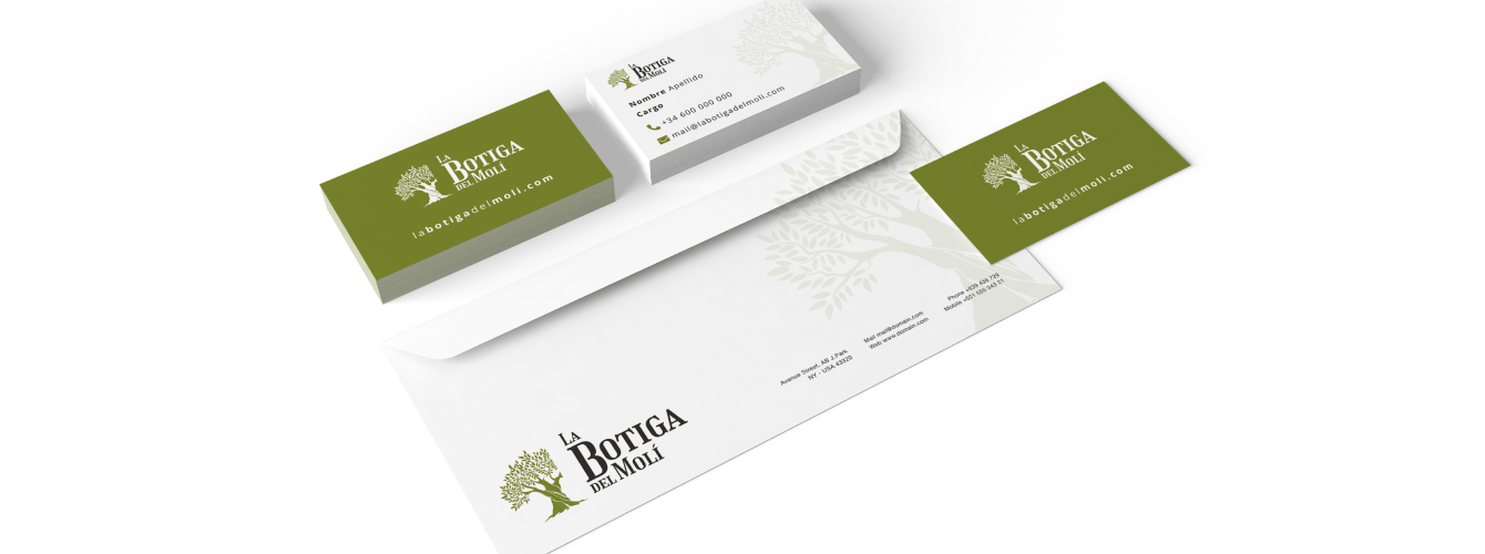
The final logo was presented in a distinctive olive green, reinforcing the visual connection to the product and its origin. The choice of color, combined with the typographic weight and layout, created a horizontal balance that conveys solidity and professionalism. This visual identity not only communicates the values of sustainability and tradition inherent to La Botiga del Molí but also reflects its commitment to proximity, quality, and respect for the environment. The result is a brand with personality that emotionally connects with its audience and strengthens its position in the market.